Product Experience
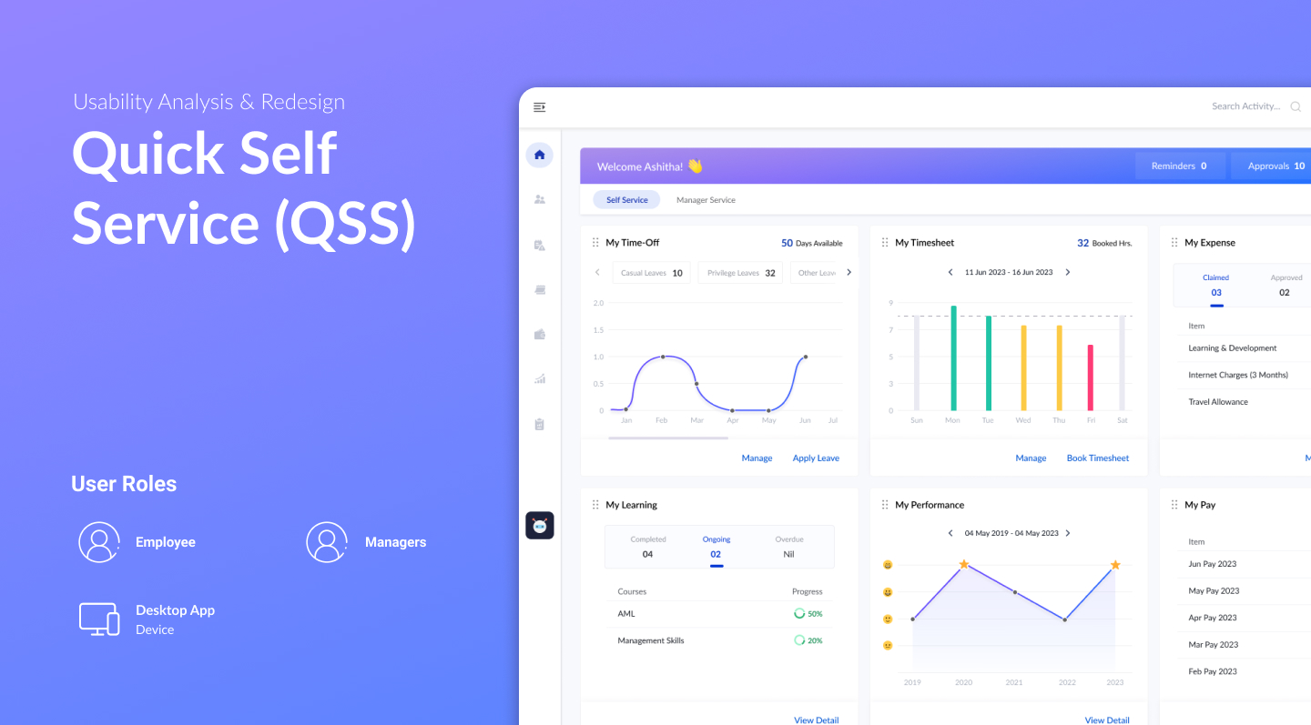
Quick Self Service (QSS)
When the product development platform underwent a re-architecture, it created an opportunity to revamp Employee Self Service with a fresh approach. Quick Self Service (QSS) is a portal landing page designed for both Employee Self Service (ESS) and Manager Self Service (MSS) roles. The project involved a structured usability analysis — interviewing and testing with 10 diverse end users — to surface what was broken, what was working, and what the redesigned dashboard needed to solve.
 1 / 3
1 / 3A Re-Architecture Opens the Door to Fix What Was Broken
When the product development platform underwent re-architecture, it created an opportunity to revisit Employee Self Service from the ground up. The existing system had usability debt built up over time — a carousel layout that hid content, a rigid widget order, no quick actions, and a context-switching problem for dual-role users. The redesign was scoped to address all of these within the new platform.
10 Users. 4 Roles. One Structured Usability Test.
Interviewed and tested with 10 end users across four profiles: 3 Employee Self Service users, 3 Manager Self Service users, 2 power users (one frequent traveller making travel claims, one manager with more than 12 direct reports), and 2 new joiners each with a different role. The range was deliberate — to surface friction that only shows up under real usage conditions and varied workloads.
- 3 ESS users · 3 MSS users · 2 power users · 2 new joiners
- Power users exposed gaps that regular users had learned to work around
- New joiners revealed discoverability issues invisible to experienced users
Four Friction Points Consistent Across All User Types
The usability sessions surfaced four consistent problems. First, the carousel-style presentation required users to navigate slide by slide to discover available content — most stopped before seeing everything. Second, activity widgets were locked in a predefined order with no way to rearrange, customise, or hide infrequently used ones. Third, there were no rapid actions for frequent tasks — every routine action required the same multi-step path. Fourth, users with both Employee and Manager roles were forced to constantly switch contexts to complete work associated with each role.
- Carousel layout: content hidden behind consecutive slides — users stopped exploring early
- Fixed widget order: no flexibility to rearrange or hide infrequently used sections
- No rapid actions: frequent tasks required the same full navigation path every time
- Context switching: dual-role users (ESS + MSS) had to switch views to complete their work
What Was Already Working — and Worth Keeping
Alongside the problems, the research identified patterns that were genuinely useful and appreciated by users. Separate card sections effectively surfaced the key information and gist of each activity. Visualisations helped users quickly understand the status and progress of activities. Summaries and progress indicators provided a sense of accomplishment and made it easy to see what was done versus pending. And having all ESS activities in a single UI — rather than across separate screens — let users immediately identify what needed their attention. These were carried forward into the redesign.
- Card sections: effective at surfacing key info and gist per activity
- Visualisations: highly useful for quickly reading activity status and updates
- Summaries & progress: provided visibility and a sense of forward momentum
- Single UI for all ESS activities: users could immediately see what needed action
- One issue: too much detail inside each card created clutter — kept the pattern, reduced the density
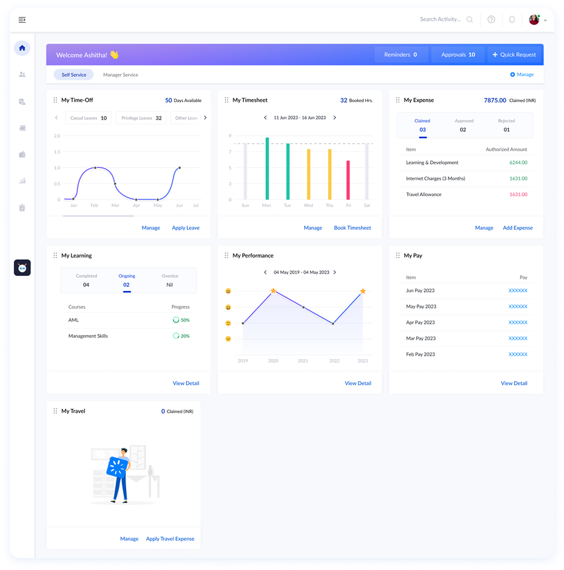
Employee Self Service — All Activities, One View
The Employee Self Service dashboard surfaces all key activity areas — Time Off, Timesheet, Expenses, Learning & Development, Performance, and Pay — in a persistent card layout. Each card shows a summary and visualisation so employees can instantly read their status without drilling in. Rapid actions are available directly on the dashboard for frequent tasks. The carousel is gone; everything is visible on load.
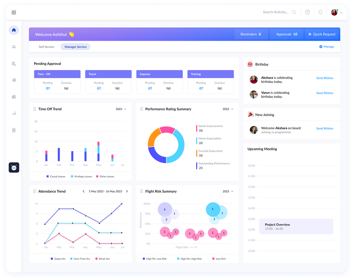
Manager Self Service — Team Visibility at a Glance
The Manager Self Service dashboard gives managers immediate visibility into Pending Approvals, Time Off Trends, Performance Rating Summaries, New Joiners, Birthdays, Upcoming Flexi requests, Attendance, Flight Risk, and Project Overviews — all from one landing page. For users who hold both ESS and MSS roles, both tabs are accessible within the same portal — eliminating the context switch entirely.
All Four Findings Addressed in the Redesign
The QSS Dashboard directly resolves each of the four usability findings: the persistent card layout replaces the carousel, widget customisation replaces the fixed order, rapid actions surface frequent tasks without full navigation, and the unified portal tab structure eliminates context switching for dual-role users. The patterns that were already working — cards, visualisations, summaries — are preserved and refined.
- Carousel replaced by a persistent, always-visible card layout
- Widget layout is now customisable — rearrange, prioritise, or hide infrequently used sections
- Rapid actions available directly on the dashboard for frequent tasks
- ESS and MSS unified in one portal — dual-role users no longer need to switch contexts
Ask About This Project
Ask about this project